We’ve changed the color scheme of our site to a dark theme. We did this because monitors emit less radiation when displaying dark backgrounds, which is easier on the eyes.
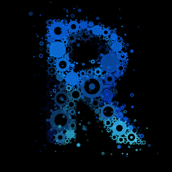
Here’s our new logo. We love it!
Our banner’s a work in progress; we have an artist working on a brand-new concept, and we’re really excited about it!
We look forward to unveiling our new banner and to giving credit to the artist of it and our new logo, and telling you about his connection to the Revit add-ins community!
If…
Read more


Leave a Comment
You must be logged in to post a comment.