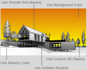
Edwin Prakoso over at CAD Notes recently posted a few tips on how to make your Revit presentation views look more engaging and interesting. Here are my top 4 from his top 10:
- Use ambient shadow. It gives more impact … and makes sure your view doesn’t look flat.
- Use sketchy lines. Hand drawing images often look very artistic and interesting. You can achieve the similar effect by using this option.
- Enable Smooth Anti-aliasing. It gives great impact when you use sketchy lines option.
- Use background color. You can play with the background color to make it stand out.
One that I would add would be to add a little bit of Transparency. See some example settings below:
Do you have any tips to make your Revit views look better? Feel free to comment here.
The post Your Revit Views Don’t Have to Look Flat and Boring appeared first on What Revit Wants.


