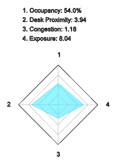
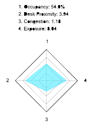
One of my pet peeves with Dynamo – as I typically use it standalone from Revit – is the quality of the text you can generate as graphics: the Dynamo Text package will generate curves (actually lots of little lines) that represent the outline of your characters, but they often look quite lame depending on your zoom level. Actually scratch that – they look lame irrespective of the zoom level. Sigh.
Anyway – today I finally dug into what I needed to do to create better-looking text as output from your Dynamo graphs.
My first attempt was to create a bunch of closed curves from the line segments, and then patch them with surfaces. Which looked liked I’d gone spray-painting with a poor stencil.
With some thought – and a little bit of sweat, I admit – I settled on a process that works well:
- Take the output from the Dynamo Text node.
- Create PolyCurves from the line segments using Ampersand’s PolyCurve.ByCurves node.
- Process the (hopefully now closed) loops with a Python…


