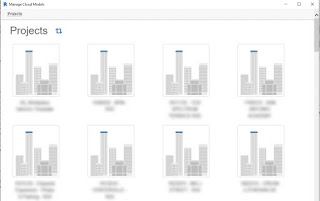
I wish the list of projects I get when I use Manage Cloud Models (BIM 360 projects) didn’t waste sooo much real estate. These big icons are a waste of space, they just mean lots of scrolling. Well if you only have a couple projects on BIM 360 maybe it’s no big deal to you. But hundreds? I keep looking for a View option of “List” or “Details” … something to shrink this bugger down.
That’s my experience with Revit 2020 at the moment when a good many projects that I get to look at reside. I’ll have to check out 2021 to see if it is any different.
Read more


