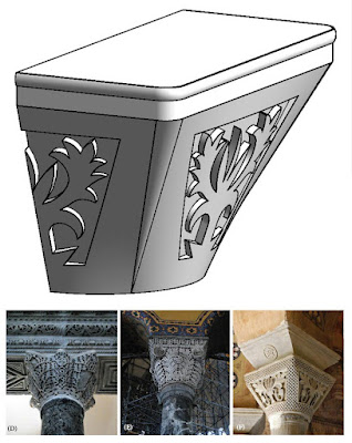
Byzantine columns are interesting. There is some kind of relationship to the classical orders, but the feel is very different: less refined, kind of rustic, more carefree perhaps. There is a tracery feel to the motifs in contrast to the crisp, sculptural, geometry of the classical orders.
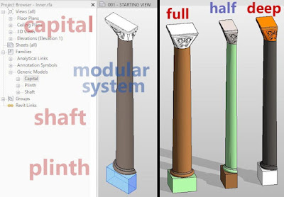
My modular system for generating columns uses the scaling behaviour baked in to the Planting category. This has its shortcomings. The levels of nesting can get a bit too deep. But it’s a quick way of leveraging previous effort to create new variants which can be sized to whatever situation could arise, from window jambs to Nelson’s column.
My first attempt at a Byzantine capital is designed to allow for several variants. The core geometry is a blend between a circle and a rounded square. To make this work you need to split the circle into 4 quadrants. The faces are not truly flat, but they are flat enough to stamp out a pattern using a profile with a short path. This means I can develop…
Read more


