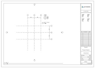
I wrote about one way to achieve using smaller grid bubbles in different views HERE. That written I can’t help but wonder how much smaller is appropriate. A user recently complained they need a smaller grid bubble in a 1:1000 (metric) view. My gut reaction was “really?…maybe the grid bubble is just too big to begin with?” For example, this is what 1:100 and 1:1000 scale views look like side by side for a tiny footprint of grids using a stock grid family (6.5 mm radius/4.5 mm text).
That image is captured after using Zoom to Fit. How effective are grid bubbles at that scale to begin with? In imperial units that’s equivalent to a view scale of 1″=120′-0″. Keeping in mind that Revit’s bias is to maintain the printed size of annotation, how much smaller does the bubble and text need to be to be better but still useful? This next image is the same sheet with grids bubbles that are half as big, text half as high (3.25 mm radius circle and 2.25 mm text)…


Leave a Comment
You must be logged in to post a comment.